

Does Batting Have a "Hot Hand" Effect?
Does Batting Have a "Hot Hand" Effect?

Hot and cold streaks are inescapable in any baseball broadcast (or basketball, or perhaps any other sport for that matter.) When a player significantly over (or under) performs for a sustained period of time, it catches our attention. The announcer deems them “hot,” or “on fire.”
Why do we say this? We may just care about player streakiness to describe the recent past. More likely, though, is that we’re seeing a pattern that we hypothesize will continue into the future. If Aaron Judge has been on a tear in recent games, we have a heightened expectation of seeing a positive outcome in his next plate appearance. What does the data say about this? Should we care when the announcer says someone is on a hot or cold streak? Let’s find out.
Before we get started, I’ll also shamelessly plug Baseball IQ (the newsletter you’re reading right now.) If you’re interested in baseball research and analysis, consider signing up to get studies like this one delivered straight to your inbox!
Prior Work
This problem has been studied by many analysts across many sports. Should-be Nobel laureate Amos Tversky first studied the hot hand effect in basketball in 1985, finding “no evidence for a positive correlation between the outcomes of successive shots” (so, no hot hand). Some follow-up studies have found positive effects, but usually with small magnitude (so maybe there is a hot hand effect, but it’s small enough where we can debate whether it really matters.)
Similar studies exist in baseball. This analysis focuses on the approach taken in The Book, by Tango, Lichtman, and Dolphin, though many other studies of hot streaks in baseball exist. Tango et al. look at sustained periods of high or low weighted on base average (wOBA), and see if the following one or several games for these players are similarly hot or cold. The study finds that both extremely-hot and extremely-cold players revert almost entirely to their mean expected performance following a streak, suggesting a hot-hand effect that exists, but is so small that we shouldn’t really care about it in practical terms.
This post is going to replicate the methods used in this 2006 study on a much larger dataset, extend its methodology by controlling for additional factors such as park effects, and see if its findings still hold today.
Methodology
The data used in this analysis come from Chadwick Bureau’s box score dataset, which is itself taken from Retrosheet. One row in the raw data represents a single player’s performance for a given game. Given these stats, I weight all events to create wOBA scores using the original wOBA formula. The dataset covers all games played from the 1999 through 2019 seasons. Following the original study, I removed all games played at Coors Field (a notable hitter’s park due to its altitude) and by Rockies players.
I define a hot or cold streak as follows: a hot (or cold) streak is any X-game period where a player’s wOBA is in the top (or bottom) 5% of all the observed X-game stretches that happened for all players. X can be varied here depending on how long you think a player needs to show outlier performance in order to demonstrate that they’re on a streak. Following the original study, I use 5 and 7 game streaks. In order to qualify as a streak, the player needs to have averaged at least 4 plate appearances per game during the streak. The top and bottom 5% thresholds for 5-game streaks in this dataset were roughly .544 and .168 respectively.
I test whether these streaks are predictive of future performance using two measures: the player’s wOBA from the game happening immediately after the streak, and from the following X games (where X is either 5 or 7, depending on how long the streak is that this period is being compared to.) Similar to with the streaks themselves, I remove observations from this dataset if a player’s post-streak period does not contain at least 3 plate appearances per game on average. If the streak is predictive of future success, one or both of these measures should be above the player’s expected level of performance (or below expectation, in the case of cold streaks.)
How do we define “expected performance?” The Book defines expected performance as a player’s wOBA from the three seasons surrounding the streak (so if a streak happens in 2002, the player’s expected wOBA is their combined wOBA from the 2001-2003 seasons.) Improving on this slightly, I remove all plate appearances taking place during the streak from this calculation, since if we assume hot streaks are real, we should not consider them a part of a player’s expected performance. Note that, because the previous and following seasons are used to calculate this Expected wOBA value, streaks from the first and final seasons in this dataset (1999 and 2019) can’t be used in this analysis. Players for which this calculation could not be created (for example, players in their final season) were also excluded from this analysis.
To illustrate, here are the ten hottest and coldest five-game stretches of the 2018 season, alongside their expected wOBA and how these players performed in the following five games.
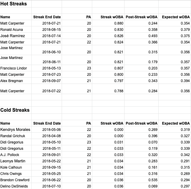
The above examples show a couple things. First, note that the average expected wOBA is higher for the players with the best hot streaks than for the players with the worst cold streaks. This makes sense, since an already-good player will be more likely to get hot, while a below-average player is more likely to go cold. Second, you’ll see a couple repeat players. Matt Carpenter has three of the best hot streaks, and Didi Gregorius has two of the worst cold streaks. This is possible because streaks can overlap. If a player is “hot” for six consecutive games, for example, they’ll have two hot streaks: games 1-5, and games 2-6. Third, you’ll see there’s a lot of variation in how players perform after these streaks. Some continue their streaks, some revert to their expected performance, and some even turn around and have the opposite kind of streak, going from hot to cold or vice versa. If you’re interested in exploring this kind of thing on your own, Fangraphs’ Player Graphs feature is an easy way to visualize a player’s streaks.
So, the final setup for this analysis is a dataset where each row represents an X-game stretch for a single player (where X equals either 5 or 7). For each of these stretches, we know the player’s wOBA, their wOBA in the following one, five, and seven-game periods, a flag for whether the stretch meets our criteria for it being a hot or cold streak, and the player’s expected wOBA based on three years of data happening outside this streak. Finally, using this setup, we can identify all hot and cold streaks in the dataset, measure the wOBA that followed these streaks (weighted according to how many plate appearances happened in these post-streak games), and make a judgment about whether hot players stayed hot or if cold players stayed cold after their initial streaks by comparing these results to the players’ expected level of performance.
Baseline Results
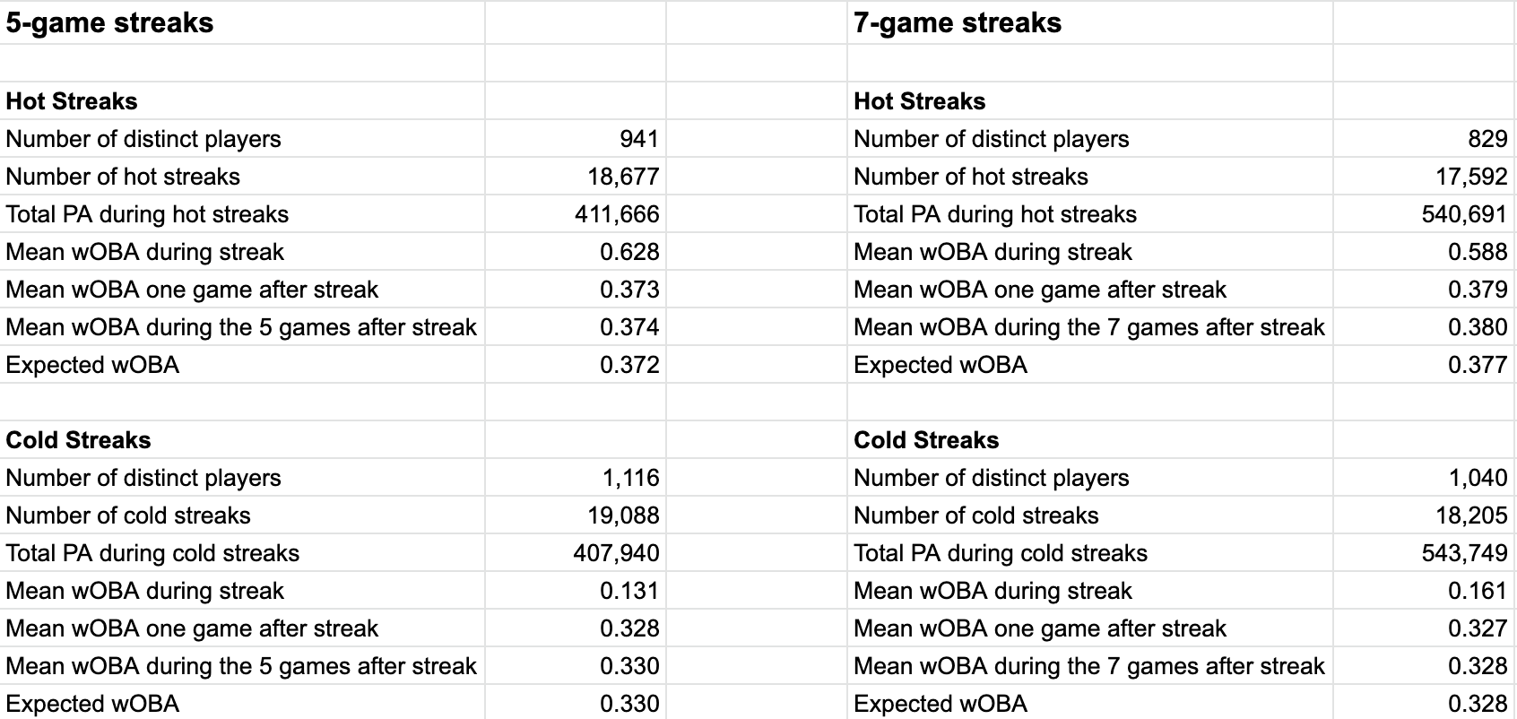
Aggregating this data using the above-described methodology gives the following results:

If hot or cold streaks hold predictive power over a player’s future performance, the effect they have must be pretty small. For both 5- and 7-game hot and cold streaks, we see the one, five, and seven post-streak games yield a wOBA within two points of the batter’s expected value.
These results agree with The Book’s study in one sense, and disagree in another. They agree with Lichtman et al. in saying that there is no large, obvious, and meaningful predictive value in what appears to be a batter’s hot or cold streak. They disagree with the original study, in that the original study was able to show a small hot and cold streak effect, where my implementation thus far suggests essentially no effect at all.
Controlling for Ballpark Effects
One possible objection to the original study’s methodology is that it doesn’t control for park effects. It does omit the most extreme example, Coors Field, since this is known to be an extreme hitter’s park, but it’s still possible that many hot and cold streaks are influenced by the ballpark dimensions and climate conditions of the player’s recent games. Maybe some of what the original study determined to be a hot streak was really just players over-performing in batter-friendly ballparks. That could certainly make it harder to detect the existence of real hot streaks, since we’d expect these faux hot streaks to revert back to average/not-hot-level performance once the player moved to a less friendly ballpark. The opposite effect could just as easily happen, where a streak is continued in a friendly ballpark, making the effect appear larger than it really is. In either case, ballpark effects are a source of noise in this analysis that we’d like to control for.
To address this, I calculated three-year component-level park effects for each stadium in this dataset, adjusted for them, and re-ran the analysis to see how much this would change the results. Ballpark effects warrant their own explainer, but here’s the brief version of what this adjustment entails and why it’s useful:
Not all MLB stadiums are equally favorable to batters. A stadium with smaller dimensions, a warmer climate, or higher altitude (see the “mile high effect” in Denver) may all favor a batter, leading to inflated performance
wOBA is a weighted average of several component statistics (1B, 2B, HR, etc.), which are all subject to stadium-level biases
I calculated a ballpark adjustment factor for each of wOBA’s component statistics using the commonly-used park adjustment formula. The formula for park-adjusting home runs, for example, is:
((homeHR_A + homeHR_B)/(homeG)) / ((roadHR_A + roadHR_B)/(roadG))
In this formula, team A is the team whose home ballpark is being adjusted, and B represents all their opponents. This looks at how many home runs happened in total within the team’s home park vs. how many happened in all away games they played in. If a team’s stadium is batter-friendly, this faction will be greater than one.
To apply the adjustment, a game’s component statistics are all divided by the corresponding park effect of the stadium that the game was played in
After applying this adjustment to all games in the dataset, I re-calculated wOBA, which is now adjusted to remove (or at least significantly decrease) stadium-level bias
It’s worth noting that park adjustments are imperfect. They implicitly control for things like local climate, for example, but it would be far better to explicitly include a temperature or humidity adjustment if this data were easily available. Some parks also disproportionately favor right- or left-handed batters, which this broad-strokes adjustment doesn’t account for. It’s definitely an improvement over doing nothing though, so let’s see if this adjustment helps to prove or disprove the existence of batter hot or cold streaks.
Our park-adjusted findings, using the same methodology as before, are as follows:
The hot streak results make a little more sense now, being more suggestive of a small hot streak effect than the previous results. The results now show a hot streak effect of one to three points of wOBA. This is still small, but it’s larger and more consistent than before.
The cold streak results are still mixed, ranging from a small negative effect (-.002) to no effect at all depending on which streak-length and post-streak measure you look at.
If a meaningful hot or cold streak effect exists, we’re not making a strong case so far.
Are These Results Statistically Significant?
So far we’ve shown aggregate measures of streak vs. post-streak vs. expected performance. Since it appears that streak effects are small if they exist at all, we should try to test for statistical significance in these findings.
One way to test for this is linear regression. Here I regress the next five games’ wOBA against whether a player has been identified as being “hot” or “cold”, controlling for the player’s expected wOBA. All wOBA values have been ballpark adjusted. Here are the results this gives:

The above regression output says that there is a small, but statistically significant hot streak effect (worth 5 points of wOBA), and no significant cold streak effect. This is somewhat flawed, though, because being hot or cold is correlated with a player’s expected wOBA, and ordinary least squares regression assumes that the regressors are independent of one another (see OLS assumption #4). This means that some of what we’re calling a hot streak effect could just be a spillover from frequently-hot players’ higher expected wOBA, since multicollinearity can diminish the interpretability of a regression’s coefficients.
Another approach is to use a t-test, to see if the difference between the means of two groups is statistically significant. Here, one group is the wOBA that followed all hot or cold streaks, and the other is the player’s expected wOBA in these same situations. A t-test for a hot streak effect shows that the difference between these two groups’ means is not statistically different from zero using a traditional threshold for statistical significance (p=.05), suggesting no detectable hot streak effect. Running this same test for a cold streak effect shows a statistically significant difference in means of 2 points of wOBA (p<.01), suggesting a small but measurable cold streak effect. This method of significance testing is imperfect because exclusively looking at the means of the two groups fails to control for other potentially relevant factors, but this at least gives us a second perspective on the size and significance of these effect sizes.
It’s finally worth noting that statistically significant results shouldn’t impress us much here. We’re dealing with large sample sizes, in a dataset containing one row per five-game streak over twenty years of play. Basically everything becomes statistically significant eventually if you make the sample size large enough. What matters, then, is deciding whether something that is statistically significant is also practically significant. In these cases, I don’t think the findings are practically significant. A couple points of wOBA above or below expectation hardly feels like a meaningful streak effect compared to these players’ prior performances being in the top or bottom 5% of the league. Add to this the fact that different methods don’t agree on the statistical significance of the findings, and I think we can safely say that these streak effects aren’t very meaningful.
So Where Does This Put Us?
Try as I might, I can’t find proof of a meaningful hot or cold streak effect that’s predictive of future performance. In broad strokes, this is roughly in line with the existing literature, which, as far as I can tell, has also failed to show the existence of a large hot- or cold-streak effect.
This doesn’t mean that streaks aren’t real. Many players insist they are. But if they are real, they’re either small enough to be really hard to measure, or we aren’t trying to measure them the right way.
I suspect a more robust regression analysis may find a larger effect size. There are several other things one could control for, such as each game’s climate, pitcher and defense quality, player health, and so on. It’s also possible that being hot or cold manifests itself in more subtle ways than this analysis assumes. Maybe a hot player gets overconfident and approaches his plate appearances more aggressively, where an increased home run likelihood’s impact on his wOBA is offset by a corresponding increase in strikeouts.
I certainly don’t think this is a closed question. Hot hand studies will exist as long as sports analysis is a thing, and I’m sure many will follow that disagree with this analysis on one point or another.
Discrepancies with the Original Study
This analysis was inspired by the study of streaks in The Book: Playing the Percentages in Baseball. In trying to replicate this work, I’ve noticed a few discrepancies between my work and the original study. It’s possible that the data sources are slightly different, or that our approaches are fundamentally different (either for good reasons or due to errors in my code.) To replicate my study, feel free to run my R scripts from this repo. The data used in this study are freely available from Chadwick Bureau. If anyone is interested in studying this further, here are a couple differences I noticed between my work and The Book’s, which may point toward future iterations on this work:
Jason Giambi’s 2003 hot streak: my dataset says his hottest streak this year had a wOBA of .620, The Book has his best streak at .742
Geoff Jenkins' 2003 cold streak: my dataset has Jenkins going cold with a 7-game wOBA of .031, but The Book’s list of the coldest streaks of this season does not include Jenkins despite the coldest streak on its list being having a wOBA of 0.060
Jeff DaVanon's hot streak: the hottest hot streak of the 2003 season listed in The Book is .742, but my dataset has DaVanon hitting .831 over a seven-game stretch that year
The point of this is not to pick on The Book, but rather to point out some unresolved mysteries that I couldn’t get to the bottom of in replicating and extending its work to later seasons. Figuring out the source of these discrepancies may lead to improvements of this analysis, if anyone wants to dig in and share their findings.
Acknowledgments
I’d like to thank Mitchel Lichtman and Tom Tango for their feedback on this piece, as well as for authoring the original study (along with Andrew Dolphin) which inspired this work. This work was also made possible by Chadwick Bureau, whose dataset I used, and Retrosheet, who provided the original dataset that I accessed via Chadwick.
New to Baseball IQ? Consider signing up to receive weekly baseball research reports and highlights.
Also, if you liked what you just read, consider sharing it!